In data science, communication is very important. Of course we know that the major data science work needs great technical skills to acquire data, clean it and perform the analysis. But as you are on the process of doing all these things, it is also very important to keep the why factor in mind. Let’s understand this way, when you are given a project in your company, it is always very important to ask yourself what value it has to the company and where it fits into the bigger picture. Knowing the answers to your entire why questions are the primary step in a process which is as crucial as your actual analysis. Here comes communication – communicating your finding with your audience which includes both data scientists and non-data scientists.
The whole idea here is how effectively and efficiently you can communicate with the mass audience and make them understand your finding as you will not always get to interact only with the data scientists who have preoccupied knowledge about data science but you also have to make the other side of the audience comfortable and understandable who are not so well versed with data science through your communication skills. Hence, presenting and communicating your insights across an organization can be extremely powerful and creative.
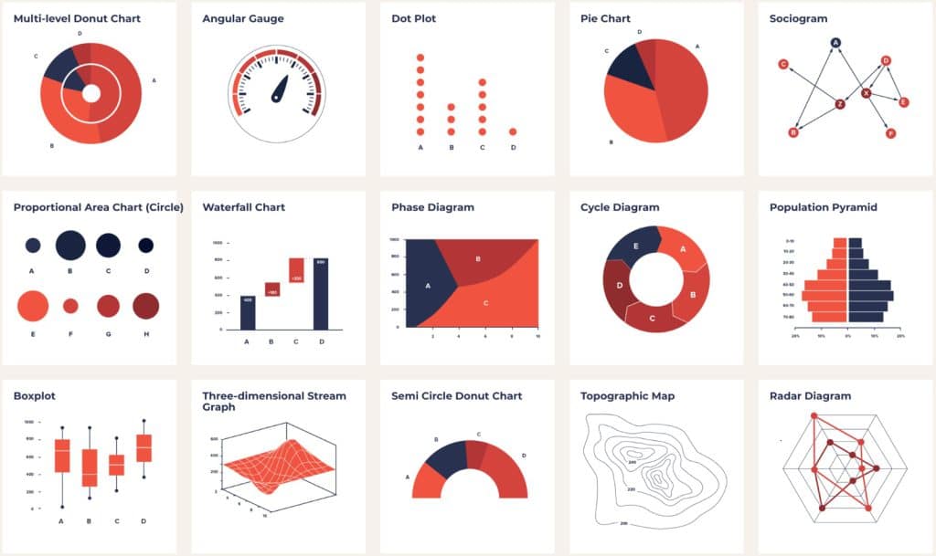
Data visualization is a latest term that denotes charts, graphs and other types of information graphics that helps the professionals communicate data and messages more clearly and effectively to the mass audience. Never ending rows and columns on spreadsheets are far too difficult to understand and grasp for many people. Hence, visualizations communicate the meaning of data better than text explanation alone.

Benefits Of Data Visualization

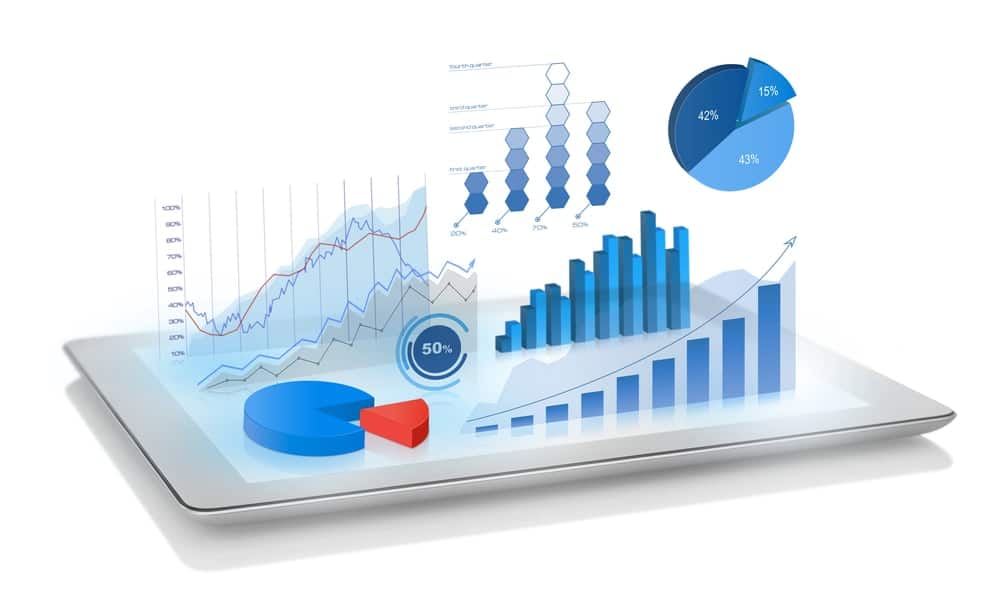
Visuals that represent data help audiences grasp numbers faster and better. With well-designed visuals, audiences can understand insights that were not so obvious to them before and incorporate those insights in their decision-making for the betterment of the business. A company’s pr representatives require better communication skills that include data visualizations and infographics to stand out, hike above text only articles and posts. Well-designed graphics also enhance the likelihood that an editor will publish your PR submission rather than a competitor’s. In order to make our presentations look more effective and outcome driven, we tend to use different icons, illustrations, even brief text as a good medium to showcase our creativity where the information to communicate isn’t purely based on numbers. But when you have access to great datasets the best way to show off your content is through the creative use of charts and graphs.
When we talk about effective data visualization, motion graphics, infographics and other visual content and how all of them can be used by the businesses to bring their data to life. The clue though in any of these mediums like motion graphics, infographics etc. Is to minimize your dependence on text so that you can create a more instinctive connection with your audience. With the growing demand of big data, data visualizations are more useful than ever. Optimum research and design are important for developing a visual that is eye-catching, informative and factually accurate. Charts and graphs don’t have to be extremely advanced to get their message across or be overwhelmingly beautiful. In fact, simple graphics or data visualizations are often the most effective and eye catching.

Contact Our Team

Biztechnosys data visualization professionals help businesses navigate any or all aspects of their data enabling businesses to create strategic digital solutions that provides tangible business outcomes
Biztechnosys is all about providing practical digital solutions by bringing data systems and people together in a fully-interactive simple to use environment integrating shared visualizations of all data from all across your organization.

Eventually our team focuses on delivering a digitally-connected business outcome. Our solution-focused teams of experts can assists you develop data visualization from the very base level.

Biztechnosys data visualization consultants use a collaborative approach which ensures that they fully clarify your business requirements and demands before designing a conceptual solution for your business.

Biztechnosys is not limited to just data visualization offerings but also allows to consult on data management, data warehouse including ETL, data marts development, big data consulting, advanced data analysis and many more.

Eventually our team focuses on delivering a digitally-connected business outcome. Our solution-focused teams of experts can assists you develop data visualization from the very base level.

As specialists in data analytics our team doesn’t only analyze administrate and develop databases but also help you with smart and appealing solutions for visualization of your data.

Tools To Be Used For Data Visualization

There are many different software packages available to automatically create charts and graphs from spreadsheets or databases. Some of the most common software to create charts and graphs are mentioned below –

Microsoft Bi

Power BI is the group name for an array of cloud-based apps and services that help businesses gather, manage and analyze data from diversity of sources through a user-friendly interface.

Power BI attracts data together and processes it converting it into comprehensible insights frequently using visually engrossing and simple-to-process charts and graphs. Power bi permits users to generate and share intelligible and useful snapshots of what is happening in their business organization.

Power BI associates to a wide range of data sources from basic excel spreadsheets to databases and both cloud-based and on premise apps.

Power BI can be mentioned to either a windows desktop application called power bi desktop which is an online SAAS service called Power BI service or can be mentioned to mobile power bi apps available on windows phones and tablets as well as for iOS and android devices.

Power BI is developed on the foundation of Microsoft Excel. Anyone who can use excel can use Power BI very easily.

Key benefits of using POWER BI –
Businesses can input enormous quantities of data into power bi that many other platforms find difficult to process.

Developed in machine learning features power bi can analyze data helps users monitor valuable trends and make intelligible predictions.

Information can be visualized using powerful templates to let businesses provide sensible and useful data.

Power BI is cloud based; therefore, users get cutting edge intelligence capabilities, powerful algorithms that are updated time and again.

Sturdy personalization capabilities let users create dashboards so that they can access the data they need promptly.

Alerts can be set up on KPIs to keep users up to date on vital metrics and measurements.

Power BI has an intuitive interface that makes it more users friendly and far simpler to navigate than complex spreadsheets.

Google Charts

Google charts is absolutely free and easy to use. Google charts can be even used and understood by non-technical users, but it’s limited in the types of charts it can construct.

Canva

Canva is one simple-to-use tool for building impressive charts in many different styles. It is a simple graphic design tool which operates based on a drag and drop format, furnishes access to photographs, vector images, graphics, fonts.

Get Started With Biztechnosys

We also provide data visualization guidance, support and maintenance services, covering everything from performance to optimization, as well as further development of your existing data system, migration from one analytical system to another. We have got you covered.